
Most hardware store dashboards track everything and tell you nothing. Transaction counts, average tickets, inventory levels, category breakdowns, vendor performance—screens full of numbers that look important but don't actually guide Monday morning decisions.
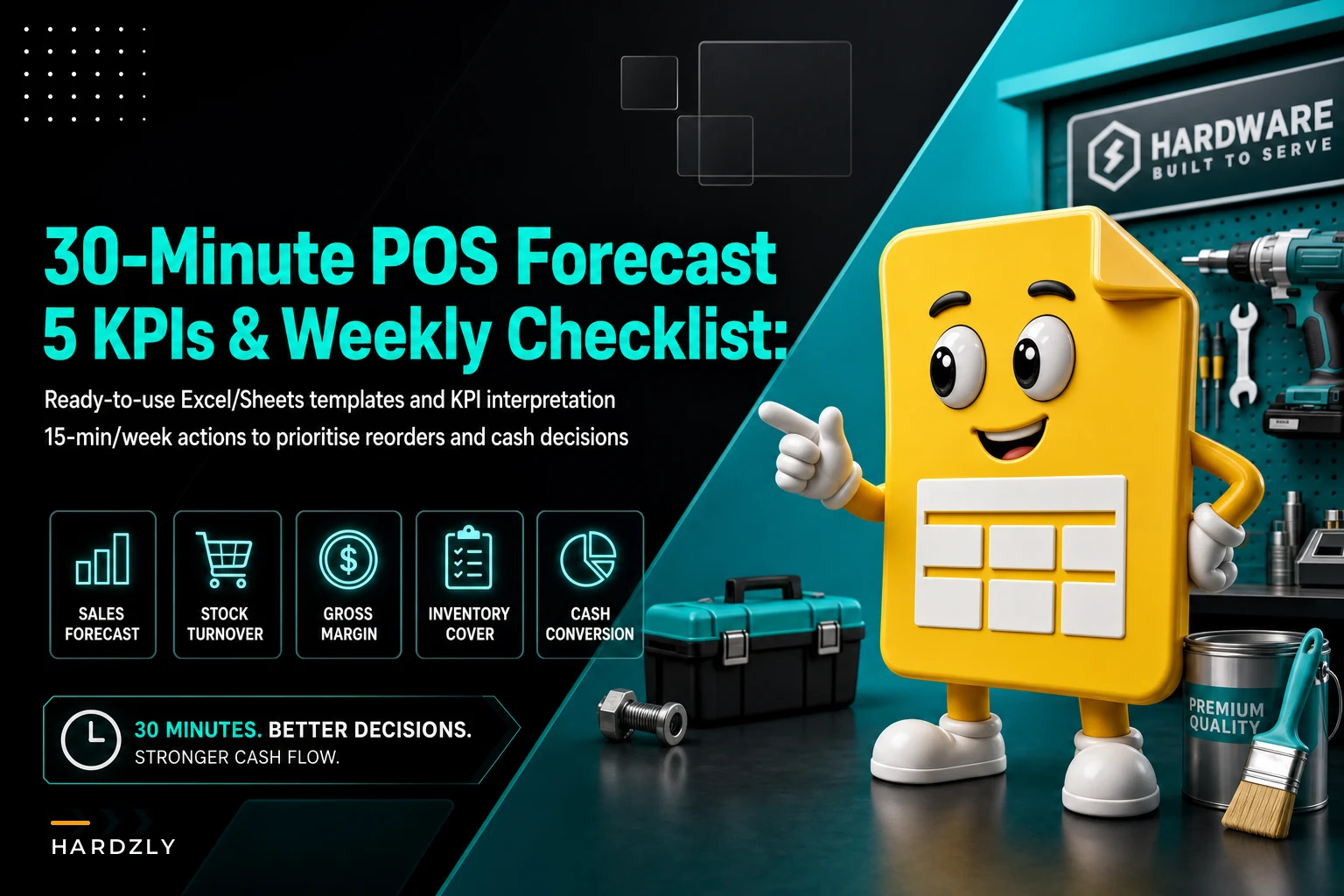
The stores that consistently hit their numbers tend to track five specific metrics in one simple spreadsheet. Thirty minutes to set up, 15 minutes to review each week, and you start catching problems before they turn into cash crunches.
The basket penetration blind spot
Hardware stores lose money in predictable patterns. A contractor walks in for PVC fittings and leaves without the primer and cement. Someone buys a circular saw blade but not the safety glasses sitting three feet away. Paint customers grab brushes but skip the drop cloths.
Your POS records all of these as successful transactions. But each one represents somewhere between $8 and $15 in missed margin, and that compounds across hundreds of daily transactions.
The real damage shows up weeks later. You're sitting on excess inventory of high-margin accessories because they're not moving alongside their primary items. Meanwhile, you're constantly running low on the things people actually buy together, because your reorder points treat everything as independent.
Why standard POS reports don't cut it for hardware
POS systems built for retail chains generate reports that work fine for clothing stores and restaurants—velocity, turns, margin by SKU. Hardware retail is different.
Stop losing sales due to inventory gaps.
Hardzly helps you manage stock levels, orders, and supplier interactions efficiently.
- Unified inventory and sales tracking
- Supplier and purchase order management
- Automated workflow and task scheduling
No credit card required
A Tuesday morning at a hardware store looks nothing like a Tuesday at Target. Contractors show up at 6:30 AM for job site supplies. DIY homeowners browse on weekends. Emergency repair purchases spike without warning. Seasonal swings make last year's data nearly useless for near-term forecasting.
Standard velocity reports tell you nails are selling well. They don't tell you that finishing nails move with trim boards, that your best carpenter buys them on a loose cycle every few weeks, or that you're losing sales because people can't find the right gauge quickly.
Category reports show "fasteners" at 12% of revenue. They don't show that screws generate twice the margin of nails, that specialty fasteners sit for months while common sizes turn weekly, or that fastener sales often correlate with lumber movement a few days earlier.
The 5 KPIs that actually predict cash position
These aren't metrics from a retail textbook. They're the numbers that determine whether you make payroll next month.
1. Attachment Rate by Core Category
Not just "items per transaction" but specifically: when someone buys a core item—drill, saw, faucet—what percentage leave with the necessary accessories? Track this for your top 20 sellers.
A healthy hardware store generally lands somewhere in the range of 40–60% attachment on power tools, 25–35% on plumbing fixtures, and 50–70% on paint. These numbers shift depending on your customer mix. A store heavy on contractors will look different from one serving mostly homeowners. Drop well below those ranges and you're leaving real money on the floor every month.
2. Dead Inventory Velocity
Count SKUs that haven't sold in 45 days, then track what percentage move in the next 15 days. This ratio predicts your cash trap roughly six weeks out.
A resurrection rate around 8–12% is fairly typical, but that's not a hard rule. Rural stores with slower-turning specialty inventory might run consistently below 5% and be perfectly healthy—they've made peace with that. The real red flag isn't any single reading. It's when the number starts declining over several consecutive weeks.
3. Contractor Concentration Risk
Calculate what percentage of revenue comes from your top 10 contractor accounts, then track the trend weekly. Healthy stores generally try to keep this below 35%.
When it creeps above 40%, one contractor switching suppliers—or hitting financial trouble—can crater your month. What matters more than the absolute number is the direction. A store at 38% that was at 20% six months ago is in a more precarious position than one that's sat steadily at 42% for years with strong account relationships.
4. Category Depth Ratio
For each major category, divide unique SKUs by weekly units sold. Paint might be 300 SKUs selling 180 units weekly (ratio: 1.67). Fasteners might be 500 SKUs selling 900 units (ratio: 0.56).
Ratios above 2.0 suggest over-assortment. Below 0.5 might mean you're missing variety customers actually want. The specific thresholds matter less than sudden shifts—when a ratio moves sharply, it usually points to an inventory decision that didn't pan out.
5. Replenishment Lag Score
Track days between POS depletion signal and reorder placement for your top 50 SKUs. Average lag over 3 days costs you sales. Under 1 day often means you're panic-ordering and overpaying for expedited shipping.
This one surfaces process breakdowns before they become stockouts. When lag scores spike, you usually have an operations problem—someone is overwhelmed, or a supplier communication channel quietly broke.
Building your 30-minute dashboard
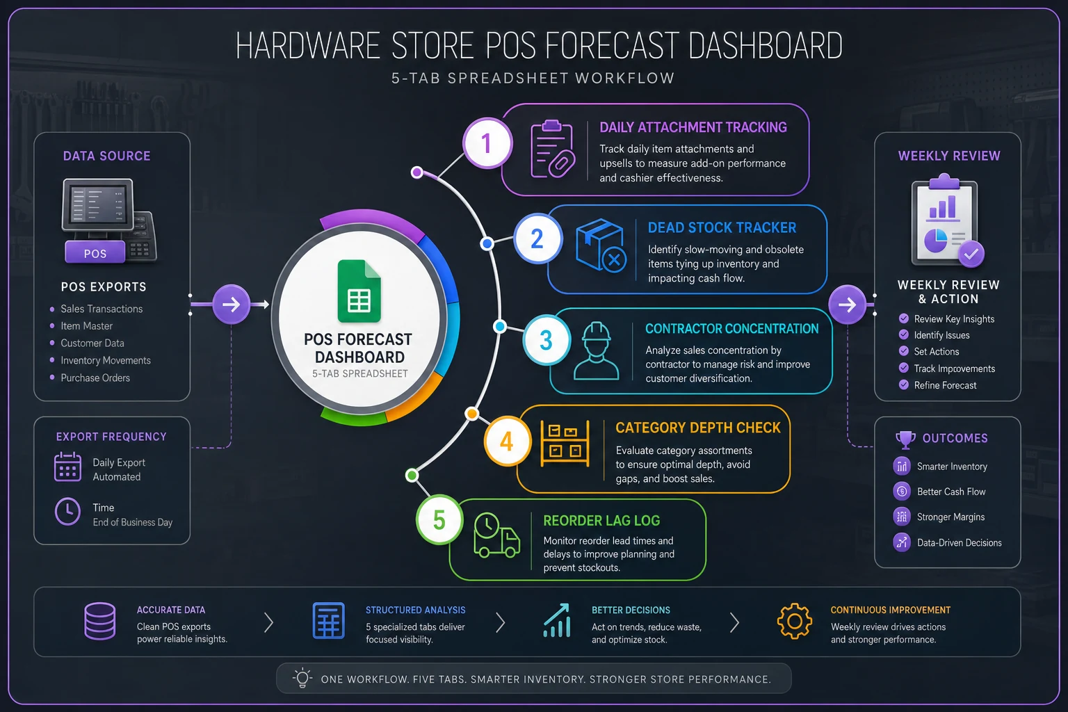
Open a new spreadsheet. Skip the templates that try to track everything. Five tabs, five formulas, a few minutes of daily data entry.
Tab 1: Daily Attachment Tracking
Three columns: Date, Core Item Sold, Attachment Sold (Y/N).
Pull yesterday's transactions for your top 20 SKUs. For each sale, mark whether they bought a logical attachment. Don't overthink the pairing logic—drill bits with drills, primer with paint, safety gear with power tools.
Formula in cell D2: =COUNTIF(C:C,"Y")/COUNTA(B:B)
Running attachment rate. Two minutes daily.
Tab 2: Dead Stock Tracker
Column A lists SKUs with 45+ days no movement. Column B shows the date added to the list. Column C marks if it sold.
Weekly formula: =COUNTIF(C:C,"Sold")/COUNTA(A:A)
Run this Sunday nights. Five minutes weekly.
Tab 3: Contractor Concentration
Top 10 contractors in Column A. Their last 7-day purchase total in Column B. Column C calculates each one's percentage of total sales.
Concentration formula: =SUM(B2:B11)/TotalWeeklySales
Update Monday mornings with a POS export. Three minutes.
Tab 4: Category Depth Check
List your six main categories. Column B shows unique SKUs (count once monthly). Column C shows last week's units sold.
Ratio formula: =B2/C2
Monthly SKU count takes around 20 minutes. Weekly sales update is two minutes.
Tab 5: Reorder Lag Log
Top 50 SKUs. Column B shows when POS hit zero. Column C shows when you placed the reorder.
Lag formula: =C2-B2
Weekly average: =AVERAGE(D:D)
Maintain this in real-time as you reorder. No extra time needed.
Focus attachment tracking on your top 20 SKUs to keep daily work under two minutes.
Here's a simple visual of the five-tab workflow to help set up tabs and daily tasks.
Maintain this in real-time as you reorder. No extra time needed.
Reading the signals: your 15-minute weekly review
Monday morning, before email, before vendor calls—15 minutes with the dashboard.
Start with attachment rate. Declining attachment usually means either staff isn't suggesting add-ons or stock positioning is off. Consistently below 40% overall needs immediate floor layout attention.
Check dead stock resurrection next. Sitting under 5% for multiple weeks means aggressive markdowns this week. Over 15% means last week's markdowns worked—but verify you're not cutting too deep.
Contractor concentration tells you next month's risk. A jump of 5% or more in a single week means you should start diversifying sales efforts now. One contractor walking at high concentration creates a cash problem fast.
Category depth ratios show inventory efficiency. Rising ratios mean you're adding SKUs faster than sales justify. Falling ratios might mean you're missing sales from lack of variety.
Replenishment lag is your operations health check. Scores creeping up usually mean the reorder process is breaking down somewhere—almost always a people or communication issue rather than an inventory one.
How the five KPIs connect week to week
It helps to understand how these metrics tend to move together. They're not independent—what happens in one usually shows up in another within a week or two.
[Attachment Rate Drop] ↓ Accessories Accumulate as Dead Stock ↓ Dead Stock Resurrection Falls ↓ Cash Tied Up, Reorder Budget Tightens ↓ Replenishment Lag Increases on Core Items ↓ Stockouts → Lost Sales → Attachment Rate Drops Further
The loop is slow enough that most stores miss it until the cash position is already stressed. Weekly reviews catch it while there's still room to act.
Common interpretation mistakes
The attachment rate trap catches people early. You see 70% attachment on drills and think you're doing great—then realize it's because only contractors buy drills and they always grab bits anyway. Meanwhile, 15% attachment on paint means homeowners can't find rollers and tape. Segment before you celebrate a number.
Dead stock resurrection at 20% looks strong until you realize it's happening through 50% markdowns. You're converting dead inventory into dead cash. Aim for resurrection at no more than 25% markdown depth—otherwise you're just subsidizing bad buying decisions.
Contractor concentration can feel comfortable at 30% until you notice it was 15% six months ago. This happens more often than you'd expect—a couple of large commercial projects come through, revenue looks healthy, the owner stops actively selling to homeowners, and suddenly the business is structurally dependent on a handful of accounts. When one of them slows down, it gets painful fast.
Some categories naturally run high depth ratios. Specialty fasteners might sit at 3.0 for legitimate reasons—that's just the nature of that product range. But when paint supplies creep above 2.0, you're probably carrying too many redundant options that customers aren't meaningfully differentiating between.
The Monday morning action checklist
Based on your dashboard review, follow this priority checklist:
If attachment rate dropped below 40%:
-
Walk the floor and verify complementary items are stocked near primaries
-
Check if common attachments are out of stock
-
Review last week's transactions for pattern breaks
-
Brief staff on attachment opportunities at morning huddle
If dead stock resurrection fell below 5%:
-
Pull bottom 20 performers for immediate markdown
-
Check if dead items have active replacements customers prefer
-
Verify dead stock is actually displayed, not buried in back stock
-
Consider donation or bulk liquidation for 90+ day items
If contractor concentration exceeded 40%:
-
Call your #11–20 contractors this week
-
Review credit terms for top 10 accounts
-
Check competitor activity with your major contractors
-
Develop backup plans for your largest account
If category depth ratio exceeded 2.0:
-
Identify duplicate SKUs serving the same need
-
Check velocity of newest additions
-
Review vendor minimum requirements
-
Plan SKU rationalization for slowest movers
If replenishment lag exceeded 3 days:
-
Audit yesterday's reorder process step by step
-
Check if POS depletion alerts are functioning
-
Review who handles reorders when the primary person is out
Most hardware stores run entirely reactive. Out of stock? Emergency order. Slow sales? Panic markdown. Contractor complains? Drop everything.
When forecasting beats reacting
These five KPIs create forward visibility. You spot attachment problems before margin erodes. You see concentration risk before a contractor walks. You catch dead inventory before it consumes cash.
The dashboard won't prevent every problem. But it shifts you from Monday morning surprises to Monday morning decisions. Instead of discovering you're out of paint brushes when a customer complains, you catch the declining attachment rate early and fix the gap before the stockout happens.
Why simple templates outperform complex systems
Hardware store owners get sold on inventory management systems with hundreds of reports and real-time analytics. Six months later, they're back to gut decisions because the system requires two hours of daily maintenance to stay useful.
This five-KPI dashboard works because it's sustainable. Thirty minutes to build in Excel or Sheets. Fifteen minutes weekly to review. A few minutes daily for updates. No special training, no complex formulas, no IT support.
The simplicity is deliberate. Attachment rate could factor in margin weighting, product relationship mapping, and seasonal adjustments—but then you need an hour to calculate it and a statistics background to interpret it. The binary "did they buy an attachment" tells you enough to act on.
Complex dashboards create analysis paralysis. You end up debating whether 47.3% attachment is meaningfully different from 46.8% instead of addressing the actual problem: paint brushes aren't visible from the paint aisle.
The seasonal adjustment factor
Hardware stores face dramatic seasonal swings that break standard forecasting. The dashboard needs minor adjustments to stay useful year-round.
| Season | Attachment Rate Threshold | Concentration Watch | Dead Stock Focus |
|---|---|---|---|
| Spring | Lower by ~10% (project buying) | Standard | Clear slow movers early |
| Summer | Standard | Raise threshold, monitor closely | Standard |
| Fall | Standard | Standard | Track seasonal SKUs separately |
| Winter | Standard | Standard | Aggressive markdown timing |
During spring rush, customers are often grabbing accessories elsewhere as part of larger project hauls. Focus instead on dead stock resurrection since slow movers should start clearing before summer.
Summer contractor season means concentration risk naturally increases. Your warning threshold shifts upward, but track it more carefully—losing one contractor hurts more when they're buying heavily.
Fall sees category depth ratios spike as you stock seasonal items. Don't confuse seasonal expansion with over-assortment. Track seasonal SKUs separately from core inventory.
Winter calls for more aggressive dead stock management. Browsing slows, resurrection rates drop, and margin opportunities shift toward heating and emergency supplies. That's where attachment rate focus tends to pay off most.
Making it stick: the first four weeks
Week one is about building the habit. Create the dashboard on Monday. Spend Tuesday and Wednesday getting comfortable with data entry. Thursday, do your first real review. Friday, note what felt awkward or unclear.
Week two is about interpretation. Numbers will look strange initially—that's fine, you're establishing baselines. Notice what surprises you. Dead stock might be higher than expected. Contractor concentration might be lower. Document where you're starting.
Week three, patterns emerge. Attachment rates might drop on weekends when part-timers work. Dead stock resurrection might spike after markdowns. Contractor concentration might jump mid-month. These patterns start informing actual decisions.
By week four, the dashboard becomes operational. Low attachment triggers a floor walk. High dead stock triggers markdown decisions. You're not just tracking numbers—you're adjusting operations based on signals.
The limits of dashboard management
This dashboard catches a solid majority of cash flow problems before they bite. But not everything.
It won't tell you a new competitor opened nearby. It won't predict when your biggest contractor's business starts struggling. It won't catch employee theft or vendor price increases. It definitely won't fix poor customer service or a bad location.
It also assumes basic operational competence. If you can't receive inventory accurately or process POS transactions correctly, the metrics become noise.
Think of it as an early warning system, not autopilot. It tells you where to look, not what to do. A dropping attachment rate signals a problem—fixing it requires walking the floor, talking to staff, and figuring out what actually changed.
Beyond the spreadsheet: when automation makes sense
This manual dashboard works well for stores doing under $3M annually. Beyond that, daily data entry becomes a real burden and weekly reviews start missing signals that matter in shorter windows.
Larger stores benefit from automated dashboard creation. Modern POS systems can export data automatically, and AI-powered operational software can calculate these KPIs daily, flag anomalies as they happen, and surface patterns that would take hours to spot manually.
The automation doesn't change which metrics matter. You still track attachment, dead stock, concentration, depth, and lag. But instead of weekly reviews, you get daily alerts. Instead of guessing why attachment dropped, the system can point to which specific products underperformed and when.
The key is starting with the manual version. Understand what these metrics actually mean for your specific store, your customers, your market. Once you understand the relationships between these numbers and real outcomes, automation amplifies that understanding rather than replacing it.
Set up the spreadsheet this afternoon—it genuinely takes about 30 minutes. Track data for one week without judging the numbers. Next Monday, spend 15 minutes reviewing what you've got.
Spend 15 minutes every Monday catching problems early, or spend weeks recovering from them later.
Ready to elevate your hardware store management?
Join 500+ hardware stores using Hardzly to boost operational efficiency, reduce stockouts, and grow revenue.